the curse of being a perfectionist is that you’re only very rarely completely and utterly satisfied with your work — read: “never”. for those who know me, they know i’m rarely satisfied with a photo … i’ll always find something in it to work on, to make it better.
COLOUR is probably the most frustrating aspect in this perfectionist’s workflow. i take colour very seriously … everything from a $2500 monitor touted to be the best of the best, to running my colour-calibration every two weeks using high-end soft- and hard-ware … checking in frequently with the labs by routinely running test prints … all to give my clients the very best of images.
and so, you can imagine the frustration when — after working long hours perfecting each image in regards to colour and white balance, hue and saturation — that it all goes to hell in a handbasket the second you upload to the Internet. sure, colours vary from monitor to monitor … not all of us are calibrated, not all of us have the same monitors … but it’s when the colours are so utterly different from browser to browser that i just kinda wanna lose it.
here you see what i’m talking about … on the left is Mozilla Firefox and on the right Explorer. i, myself, use Firefox, and still find that on some sites the colours of my images are way off … like the main scruffy dog site … very over-saturated. but hello? Explorer? the entire blog is hyper-saturated and the hue has completely gone off the rails.

so what to do? i consistently remind clients via the website and the literature i send them that colour varies from monitor to monitor; i encourage them to come to the studio for a consult where they can see the true colours on a calibrated monitor. of course, with the love of their dog clouding their judgement, maybe they don’t even see it? maybe they don’t care?
still, i do! i care a lot. that turquoise sky and orange bulldog are not in my portfolio. i’m not into hyper-saturated images with unrealistic colours … i work hard for the realistic tones and hues … so it’s very frustrating to see this depth of discrepancy, especially since the Internet — with its vast array of colour management — is the main representation and home of the scruffy dog work.
so … enough kvetching. maybe black and white is the answer. 🙂
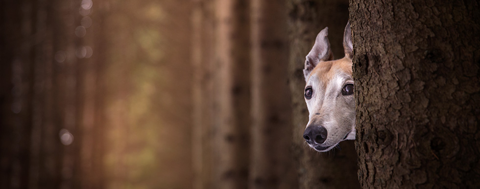
.jpg "kwhs-579")
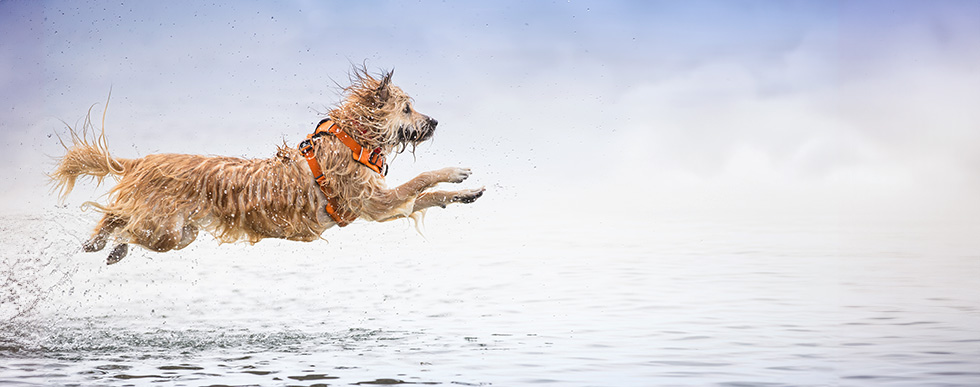
.jpg "kwhs-471")
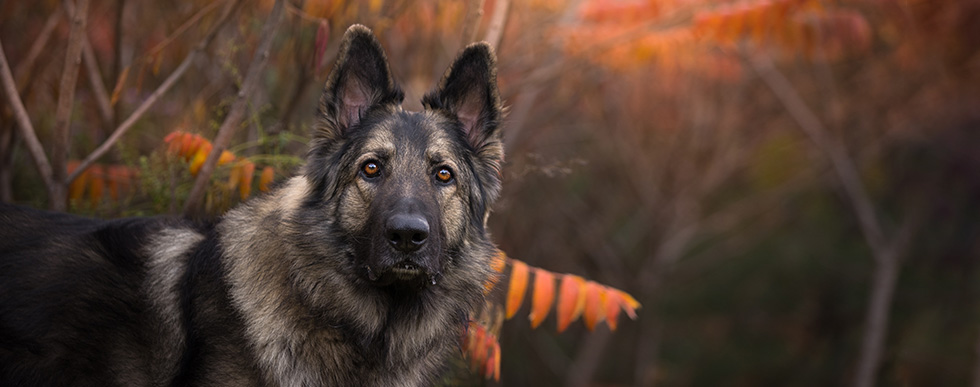
.jpg "kwhs-528")
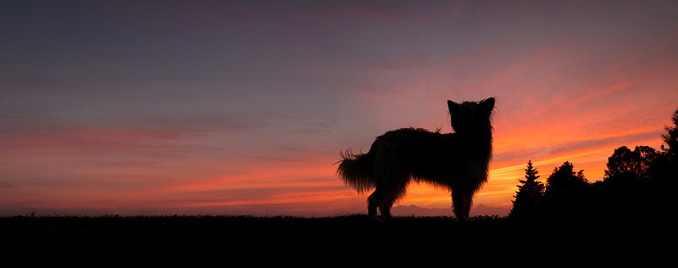
.jpg "kwhs-593-aged")
.jpg "kwhs-698")
.jpg "bella-triptych1")
.jpg "kwhs-662")
.jpg "kwhs-710")
.jpg "kwhs-792-edit")
.jpg "kwhs-891")
.jpg "kwhs-862")
.jpg "kwhs-1069")
.jpg "kwhs-1151")
.jpg "kwhs-1080")
.jpg "kwhs-884")
.jpg "kwhs-1119")
.jpg "kwhs-1156")
.jpg "kwhs-921")
.jpg "kwhs-1017")
.jpg "kwhs-957")
.jpg "kwhs-974")
.jpg "kwhs-1024-aged")
.jpg "kwhs-1189")
.jpg "kwhs-1253")
.jpg "kwhs-1187")
.jpg "kwhs-1208")
.jpg "kwhs-1265-aged")
.jpg "colour-woes1")
.jpg "kwhs-412")
.jpg "kwhs-368")
.jpg "kwhs-377-2")
.jpg "kwhs-318")
.jpg "kwhs-9")
.jpg "kwhs-39")
.jpg "kwhs-47")
.jpg "kwhs-259")
.jpg "kwhs-218-2")
.jpg "kwhs-228")
.jpg "kwhs-253")
.jpg "kwhs-265")
.jpg "kwhs-1")
.jpg "kwhs-169")
.jpg "kwhs-122")
.jpg "kwhs-168")


RogExcellent series.
You’ve proven it is possible to go from a word smith to a photographer. (And let’s keep in mind that old saying that each photo worth a thousand words but I’ve long known that no writer will ever agree to that!)
Kathy Innocenteyou have outdone yourself…this is truly a special thing you have done for the Kitchener-Waterloo Humane Society. Your generosity will not be forgotten, you have made my job as a fundraiser here at the Centre that much easier.
Holly Garner-Jacksonthese are all very awesome, illona. The ones of Meeesha gave me goosebumps!!!!!!! Her mom should be thrilled and very grateful I’m sure.
karenThese are all fantastic! How are they (or you) ever going to choose for the calendar! You’ve been a busy girl!
RuthWow, stunning photos, well done!!!
andreaillona….these are fantastic!! loved seeing the larger images….we are lining up our print order!! thanks again for all of your wonderful work with these dogs. 🙂
AndaIllona, these are amazing! Each and every one is worth printing and framing and admiring every single day!